
The Must-Know Decorating Rule to Combine Colour with Confidence
As someone who would describe themselves as a serial decorator, I’m always on the look-out for fresh new ways to combine colours in my home. Knowing how to combine colours in interior design can be pretty daunting. From understanding complementary colours and the direction of light in the room, to learning which colours blend well together… there’s so much to consider even before you pick up a paint brush.
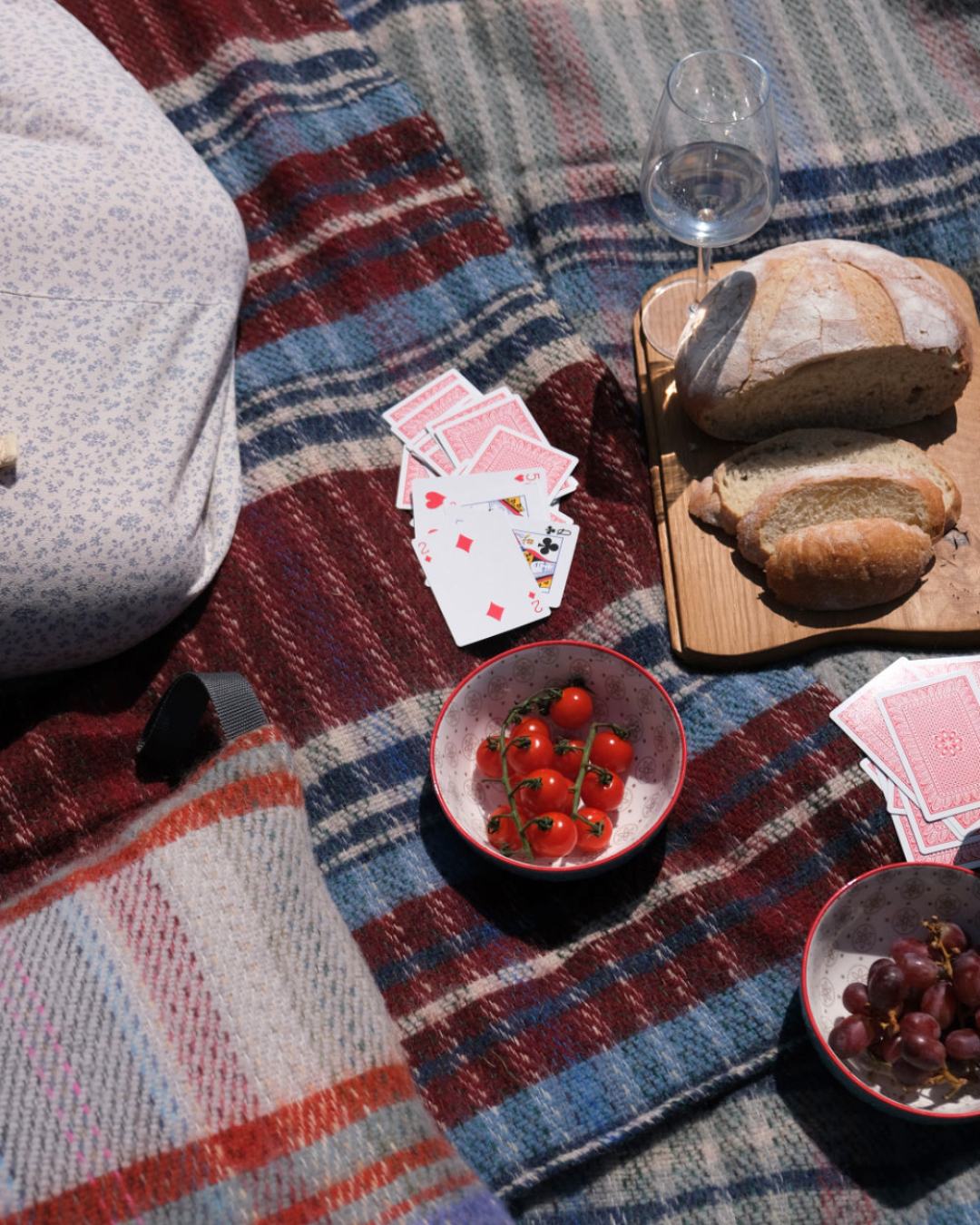
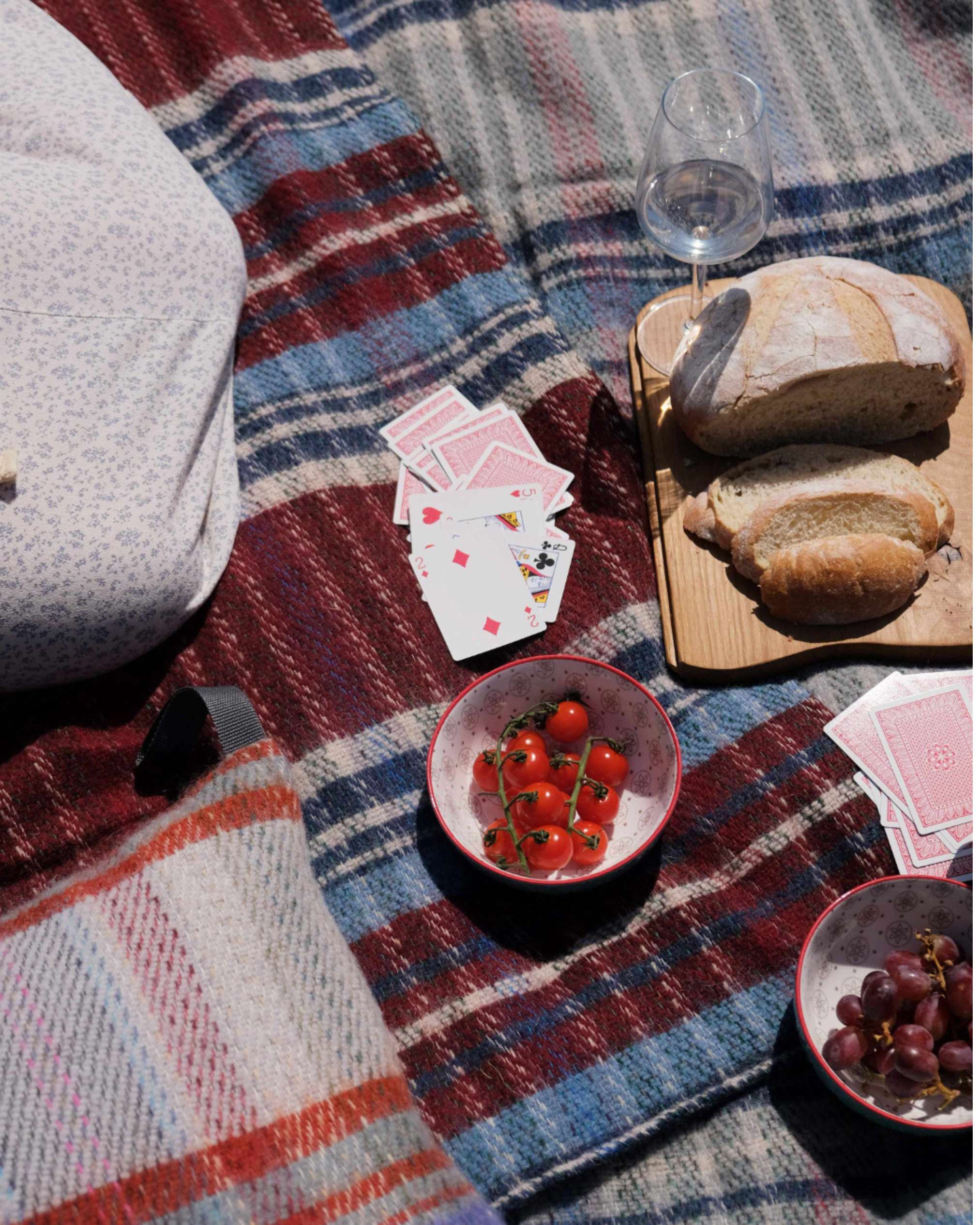
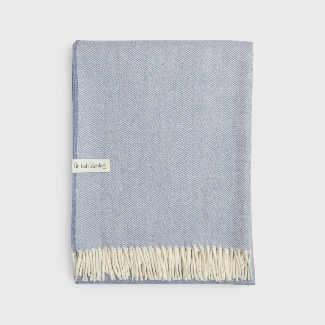
That’s one reason why The British Blanket Company’s wool blankets are so popular - they make it quick and easy to add an accent colour to a room. With the launch of our new Signature Collection throws, we’ve made adding colour at home fun and accessible for everyone (more on this later!)
In this blog post, I’ll demystify the 60-30-10 decorating rule, the must-know trick to help you put colours together with confidence. Even if you haven’t heard of it by name, chances are you’ve witnessed this rule working in practice. The 60-30-10 rule is one of the simplest and most effective ways to create a balanced interior design scheme at home.
What is the 60-30-10 rule in interior design?
In a nutshell, the 60-30-10 rule is simple interior design technique that helps you to balance the proportion of each colour used within a room, creating a harmonious look.
How to use the 60-30-10 decorating rule…
- 60% should be the main colour used in your room. Use this colour for the largest surfaces such as the walls, flooring, rugs and sometimes large furniture items, such as the sofa. By using a single colour in 60% of the room you create a coherent backdrop on which to build.
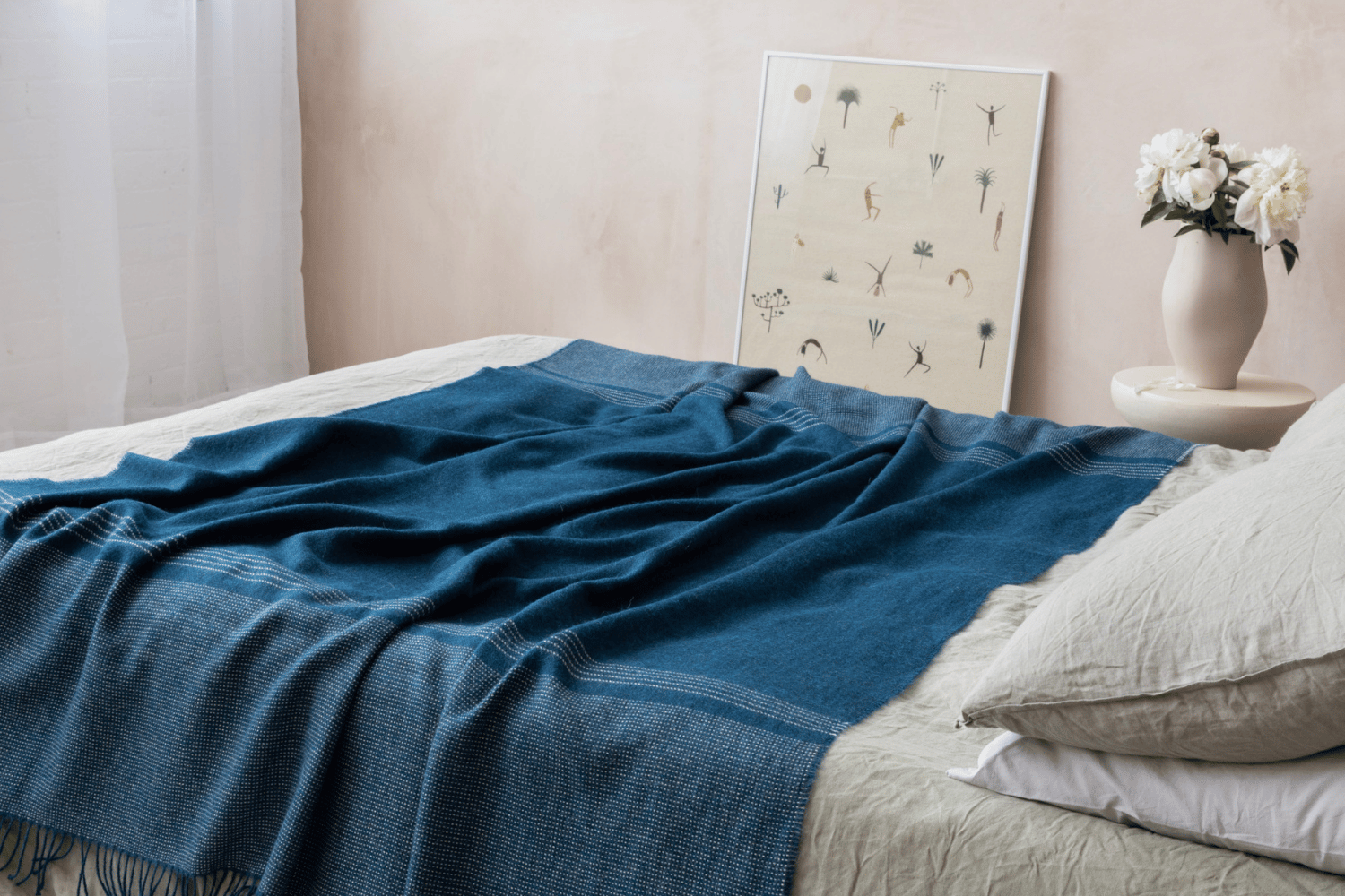
- 30% should be the secondary colour in your room – that is, use half as much of this colour as your main colour. Apply this colour to your curtains, accent chairs, bedlinen or perhaps a painted feature wall. Think of the secondary colour as a support act – different enough to your main colour to add interest, but not shouting too loud.
- 10% should be your accent colour, something contrasting to really liven up the room and make it pop. Introduce it with accessories like cushions, throws, art or vases. It could also be one colour picked out from a printed fabric or wallpaper pattern.
… And how to break the 60-30-10 rule
The key to any great creative project has always been to learn the rules before you break them. Once you understand the basic principles, you can play, experiment, and customise more successfully.
A multicoloured rainbow scheme would be a good example, or one that relies heavily on texture rather than colour. The 60-30-10 rule can still have a place though, helping you balance the proportions of the different elements. Use it as a guide to help you create interest, while also having enough visual breathing space that the room doesn’t feel chaotic.
Master the 60-30-10 rule and channel your inner Goldilocks to create a room that’s just right!
Oh ok then, have an extra 5%
One of my top interior design tips is to always add a dash of black to every room. If your scheme is feeling a little flat and lifeless, a touch of black will bring back its graphic spark. Personally, I allow myself a little black on top of my 60-30-10 rule. Every designer should aim give 105%, right?

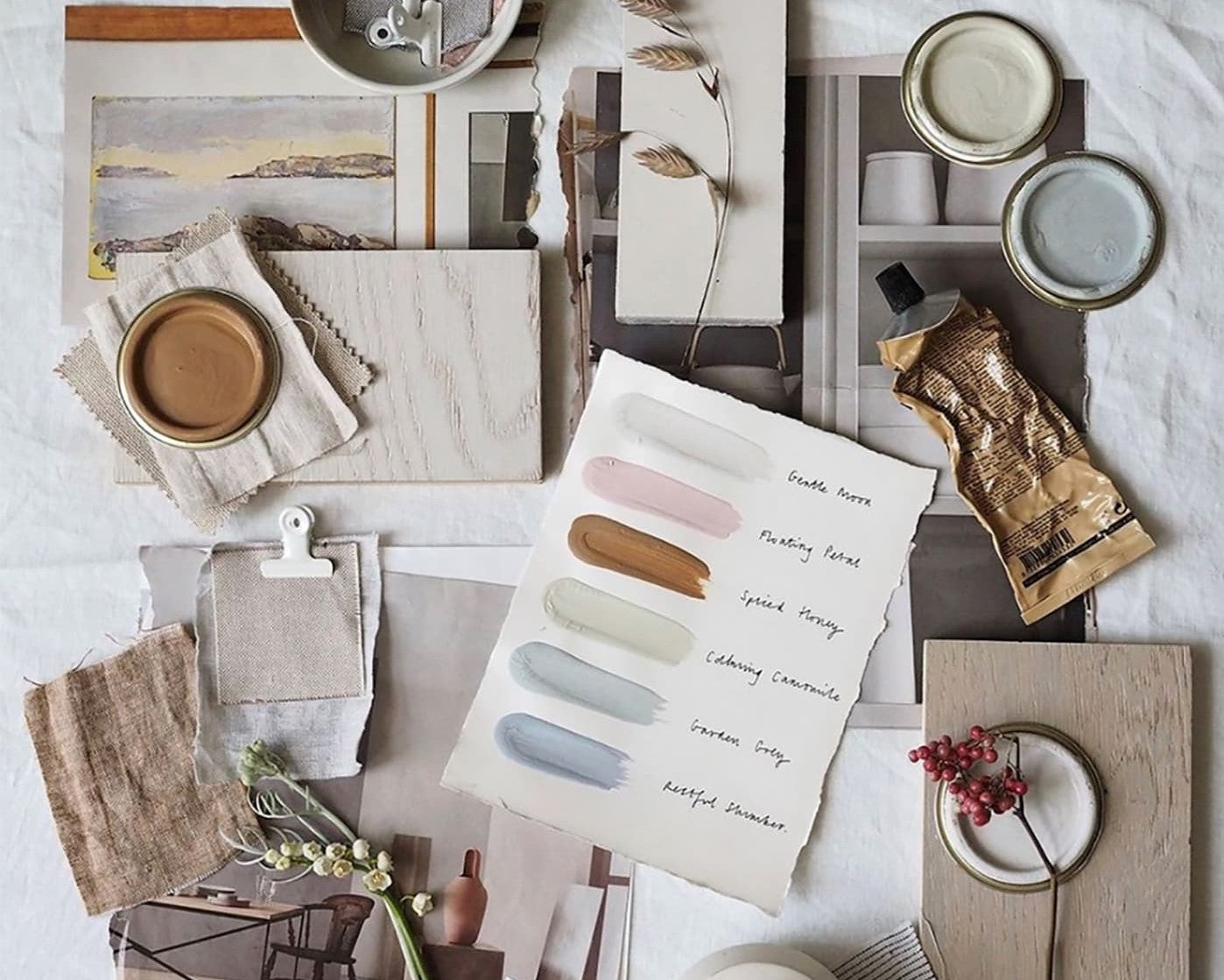
Mood boards aren't just for interior designers! They can be a great way to organise sources of inspiration, from fabric swatches and paint colours, to photographs and natural elements. We love this example by Cate St Hill.
Top 3 places to find colour combination inspiration
- You may not have used one since school, but a colour wheel can be a handy tool to understand which colours are complementary, and which colours go well together. The wheel makes colour relationships easy to see by dividing the spectrum into 12 basic hues: three primary colours, three secondary colours, and six tertiary colours. By turning the wheels you can test how different colours work together in a palette. In this article, stylist Sophie Robinson explains how to use a colour wheel to develop an interior scheme.
- Fabrics and wallpapers are a great jumping-off point for finding inspiring colour combinations. Essentially, the pattern designer has done the hard work for you, selecting colours that work together. You will usually find each pattern in several different colourways, allowing you to see alternative palettes in the same design. There are some amazing British fabric and wallpaper brands to explore – Little Greene, Paint & Paper Library, Cole & Son and Nina Campbell are just a few of my favourites. Here’s a list of many more.
- Mother Nature has the best eye for colour of all! Photographs of landscapes, flowers and birds can all be a source of beautiful and, sometimes, surprising colour combinations. Whether you’re drawn to the soft chalky colours of a rocky shoreline or the vibrant brights of a tropical forest, nature can provide some wonderful ideas.

A monochromatic scheme uses tone-on-tone colour to create a high impact look. In this room by Neiman Marcus, the dark grey shade is atmospheric and sophisticated
How to master a monochromatic colour scheme
So, this is all very well and good, but what if you don’t want to use three different colours in your room? This where the monochromatic colour scheme comes in. Contrary to common parlance, monochrome doesn’t just mean black and white. Rather, monochromatic colour schemes are derived from a single base hue and extended using its shades, tones and tints. Tints are achieved by adding white. Shades and tones are achieved by adding grey or black. You can still apply the principals of the 60-30-10 rule to create a tone-on-tone room scheme using a single colour in mid, light and dark variations.
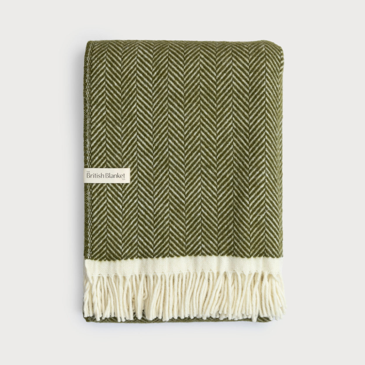
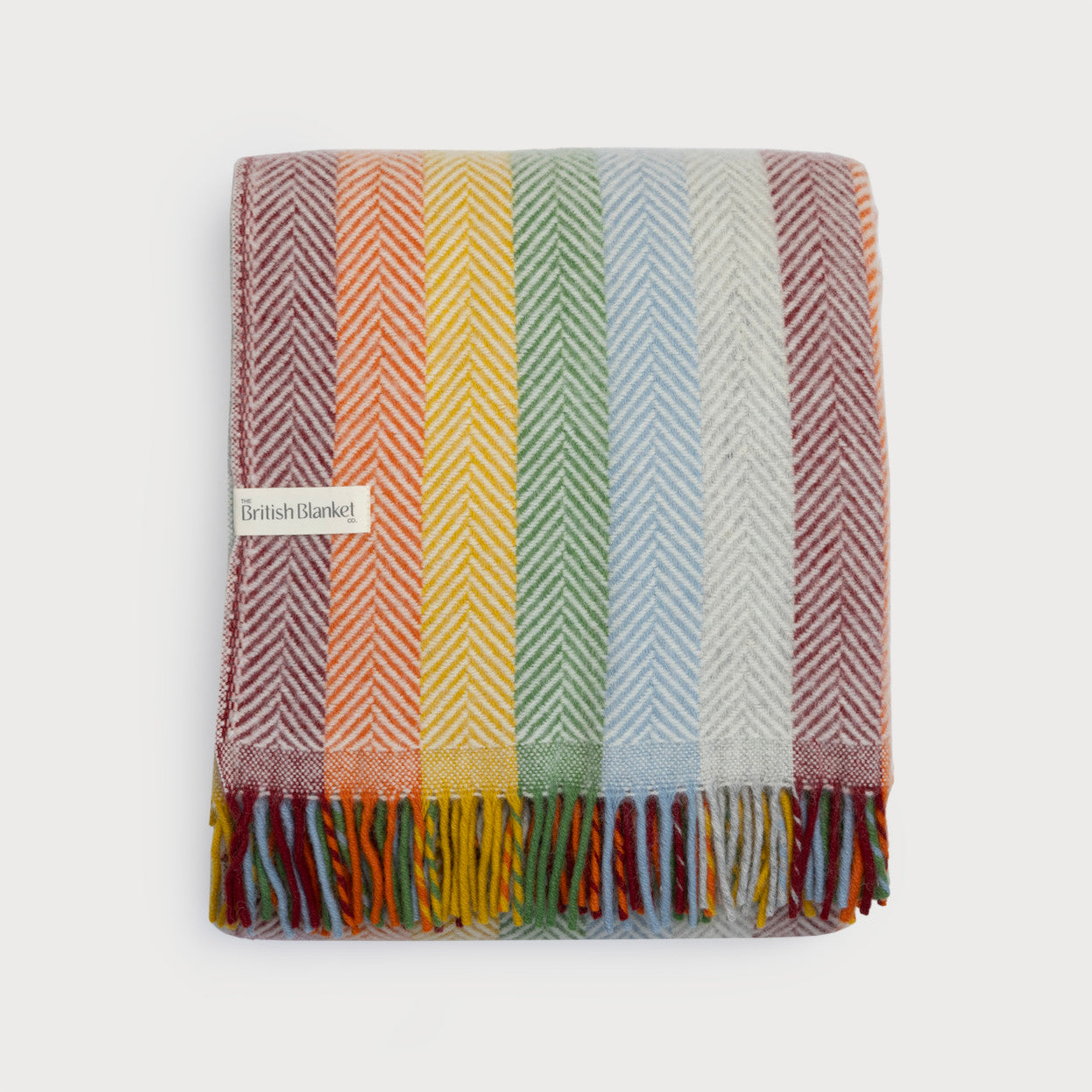
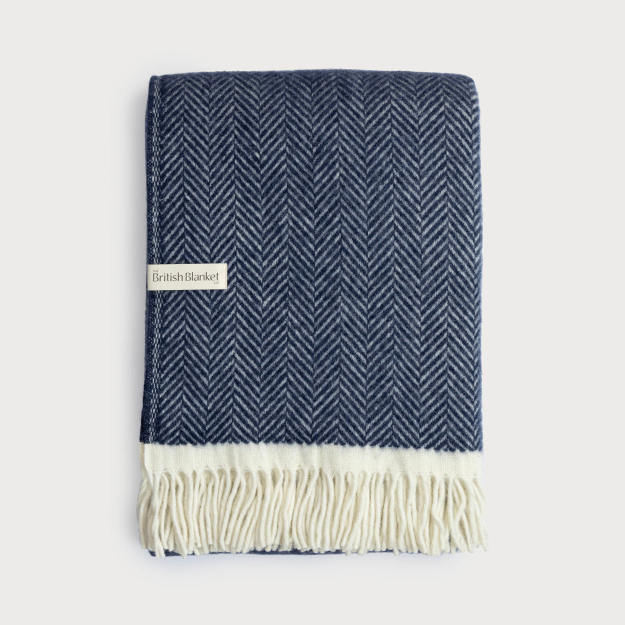
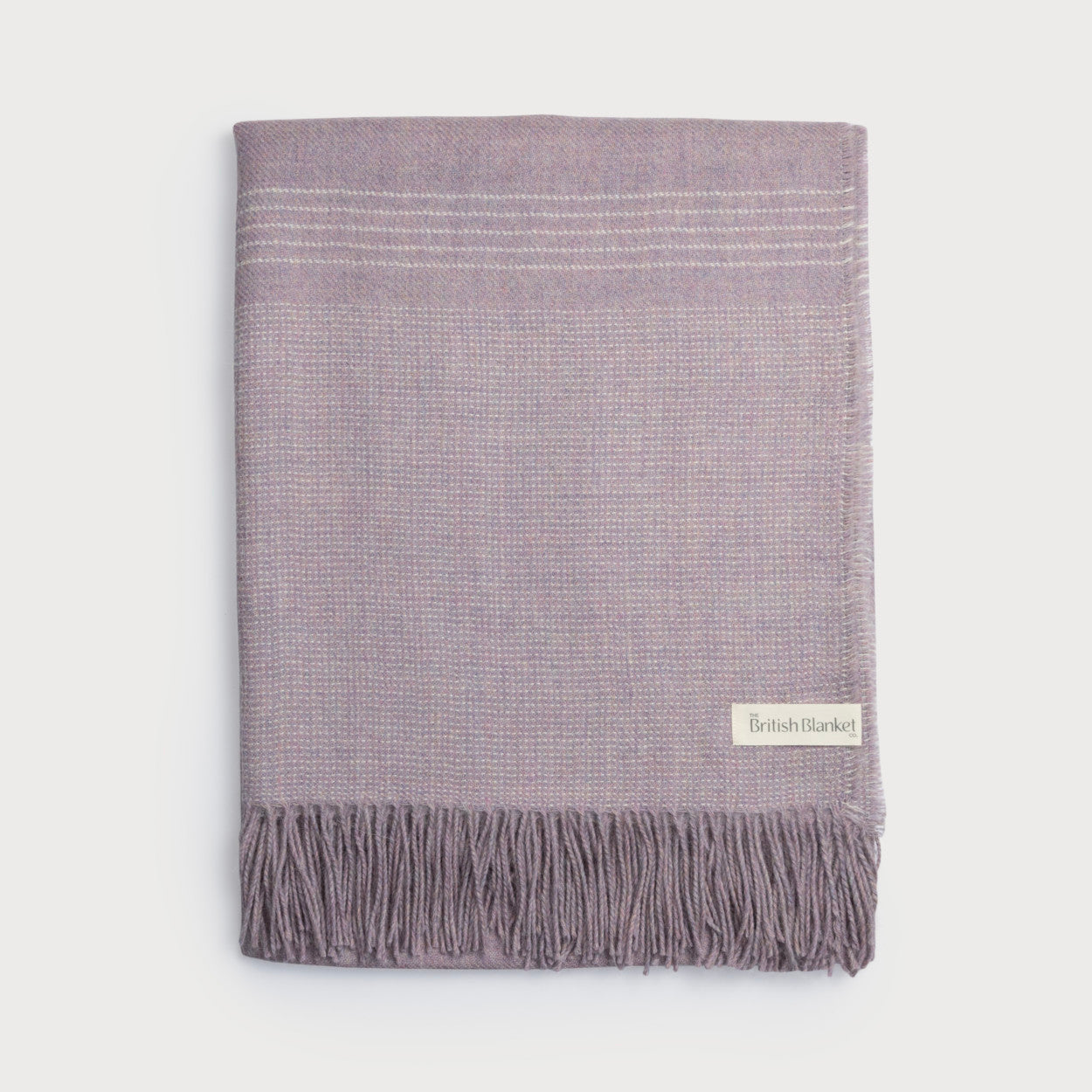
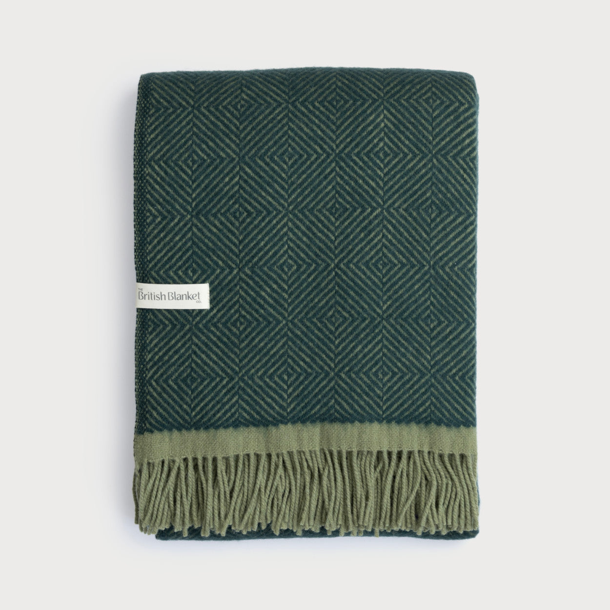
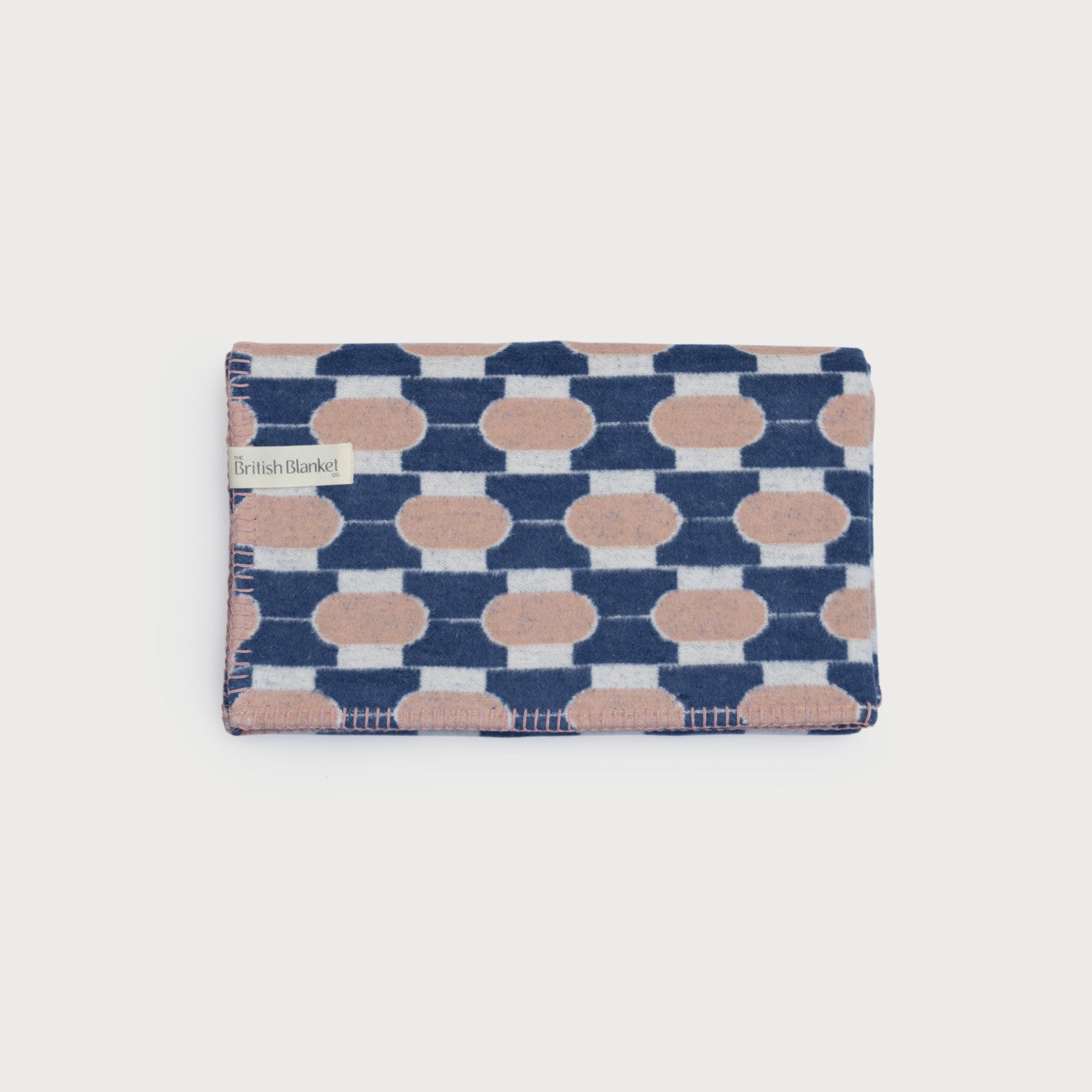
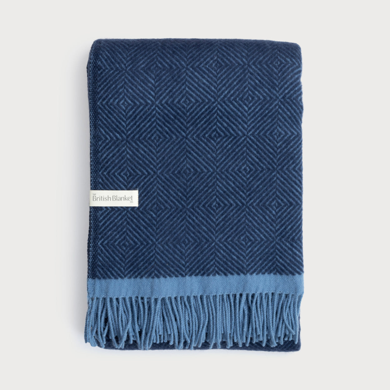
Using blankets as an accent colour
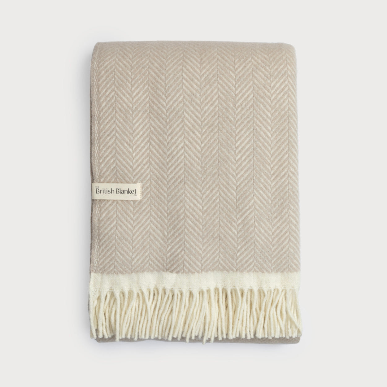
The new Signature Collection by The British Blanket Company is all about being confident and having fun with colour. These throws come in 13 colours and blankets are the perfect 10% accent colour in the 60-30-10 rule.
Have fun using our pick-and-mix colour palette to express your creativity and style. You’ll love all the different moods you can create with a Signature Collection blanket or two, from earth-toned neutrals to rich, jewel-like shades. Designed to blend in with your other furnishings, or act as an accent colour, the Signature Collection has been carefully designed with versatility at its heart.

The British Blanket Company's new Signature Collection has 13 exciting colours carefully chosen to pick-and-mix